Color Psychology in Hospitality Design
When was the last time you walked into a hotel lobby or restaurant and felt an immediate sense of calm or excitement? Chances are, it wasn’t just the architecture or furniture that worked its magic. The unsung hero? Color psychology. Hospitality design has become an art form, blending psychology and aesthetics to create spaces that evoke emotion, influence behavior, and leave lasting impressions.
So, how can you use color psychology to craft a hotel interior design that feels luxurious, welcoming, and totally irresistible? In this article, we’ll explore the impact of color psychology on hospitality design, explore tips to elevate your property, and look at real-world examples of brands nailing the color game.
What Is Color Psychology in Hospitality Design?
Color psychology is the study of how different shades and colors affect human emotions and behaviors. For example:
- Blue promotes calmness and trust.
- Red creates energy and excitement.
- Yellow evokes warmth and happiness.
In hospitality design, these principles are essential. Why? Because guests’ emotions drive their experiences, and their experiences drive your reviews and repeat bookings.
From the moment a guest walks in, your hotel interior design colors are silently communicating: “Welcome, relax, and enjoy your stay.” But if your colors are jarring, mismatched, or poorly thought out, it could be telling them to turn around and leave instead.
- First Impressions Are Visual: A hotel’s color palette is the first thing guests notice, consciously or subconsciously. A cohesive and thoughtful color scheme sets the tone.
- Shapes Emotional Responses: Want guests to feel cozy in your lobby or energized in your café? Colors can direct how they feel in each space.
- Creates Brand Identity: A consistent color palette ties into your brand image. Think of McDonald’s yellow and red or Marriott’s clean, sophisticated tones. Your hotel’s colors should reflect its unique personality.
- Boosts Guest Satisfaction: The right colors can create a sense of luxury, peace, or excitement, ensuring guests walk away raving about their stay.
Beyond Beauty: How Colors Influence Guest Behavior
Now that we know why color matters, let’s dive into how color psychology directly influences your guests behavior and emotions.
The right colors can transform your hotel’s vibe, making it more relaxing, energizing, or inviting. Here’s how you can harness color psychology to shape guest behavior:
1. Boosting Appetite with Color
Ever noticed how restaurants often lean towards reds, oranges, or golden hues? These colors stimulate appetite and conversation. It’s no coincidence that fast-food giants and fine dining establishments alike use these shades to keep the energy high.
2. Encouraging Relaxation
Luxury resorts and spa hotels often opt for soothing blues and greens. These colors slow heart rates and create an aura of tranquility, perfect for guests seeking an escape from the daily grind.
3. Creating Social Vibes
Social spaces, like hotel bars or co-working lounges, often feature warm, dynamic tones like red, gold, or even pops of purple to encourage interaction and energy
4. Extending Room Perception
Soft pastels and neutral tones can make compact hotel rooms feel airy and spacious, creating a positive first impression for guests.
Suggested Colors for Different Hospitality Spaces
The right color schemes in the right place can transform your hotel interior design atmosphere. Here’s a guide to designing various areas with precision:
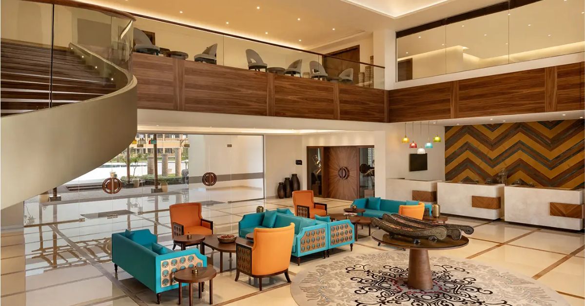
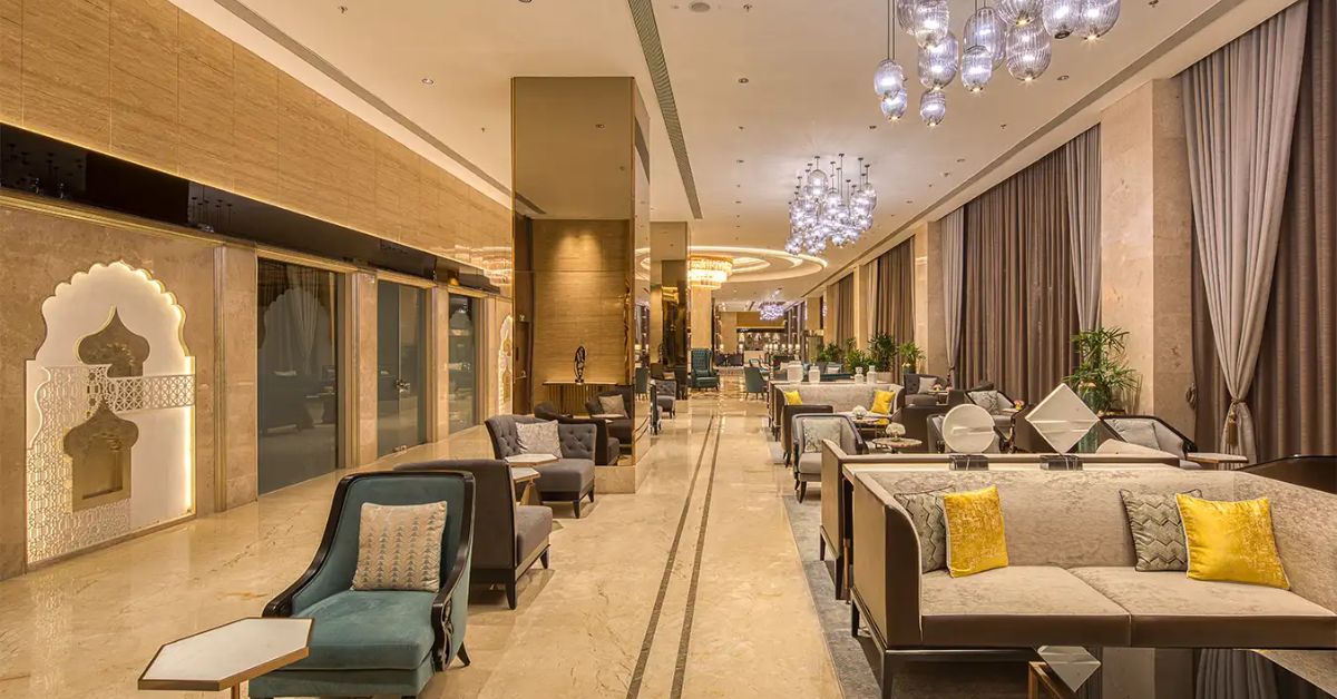
Hotel Lobbies: The First Impression
The lobby, often referred to as the “face” of the hotel, should instantly communicate warmth, sophistication, and welcome. Neutrals like cream, taupe, or beige make the space feel grounded and familiar, while accent colors like deep blue, emerald green, or even metallic gold add a luxurious touch. A splash of bold hues in small details, like chairs, artwork, or fresh flowers, can bring energy and intrigue without overwhelming the visitor. This balance ensures your lobby exudes charm and invites guests to linger, giving them a great first impression.
Designers use color schemes to tell a story the moment a guest walks in.
- Example: A tropical resort lobby may feature turquoise accents to mirror the sea and sky, immediately immersing guests in vacation vibes.
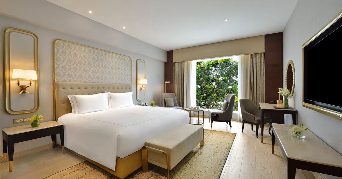
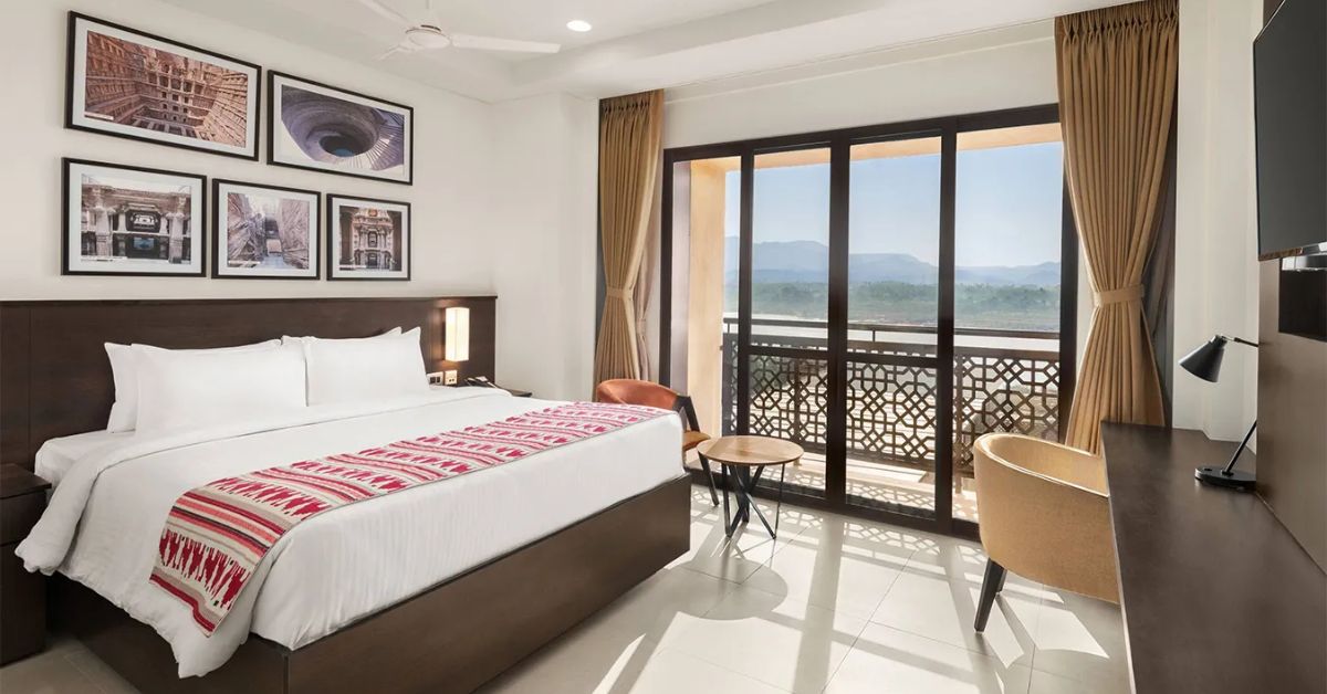
Guest Rooms
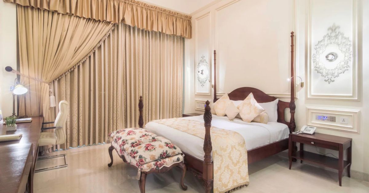
In guest rooms, comfort and relaxation are the priorities. Cool tones such as soft blues, muted greens, or light grays are perfect for creating a calm, peaceful retreat after a long day. Neutral undertones, like off-white or beige, add warmth without sacrificing the soothing effect. For a more luxurious feel, deep navy or charcoal accents, through headboards, curtains, or an accent wall, can elevate the space. Crisp white linens and minimalistic patterns keep the room feeling fresh and refined. Avoid overly bright colors, as they can feel too bold for a place meant for rest.
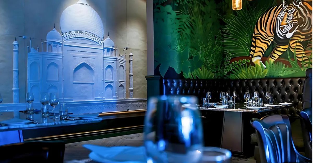
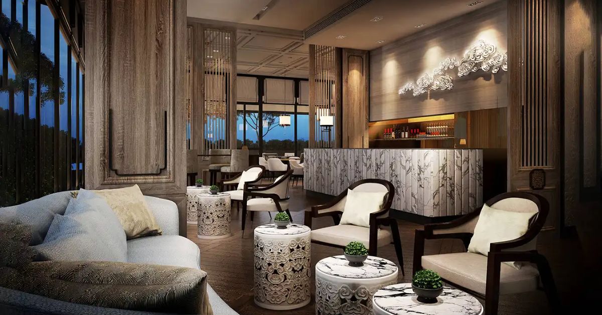
Restaurants and Cafes
For dining areas, the goal is to make guests feel energized and enjoy their meals. Warm, earthy tones like terracotta, muted orange, or golden yellow are excellent for stimulating appetite and conversation. These color schemes create a cozy, inviting environment that makes food more enjoyable. Pair them with neutral hues like gray or beige to keep the look balanced and sophisticated. For upscale restaurants, adding a deep wine red or soft burgundy accent can evoke a sense of indulgence and elegance. In contrast, casual cafes might benefit from pops of cheerful yellow or orange to set a friendly, lively mood.
Spa and Wellness Areas
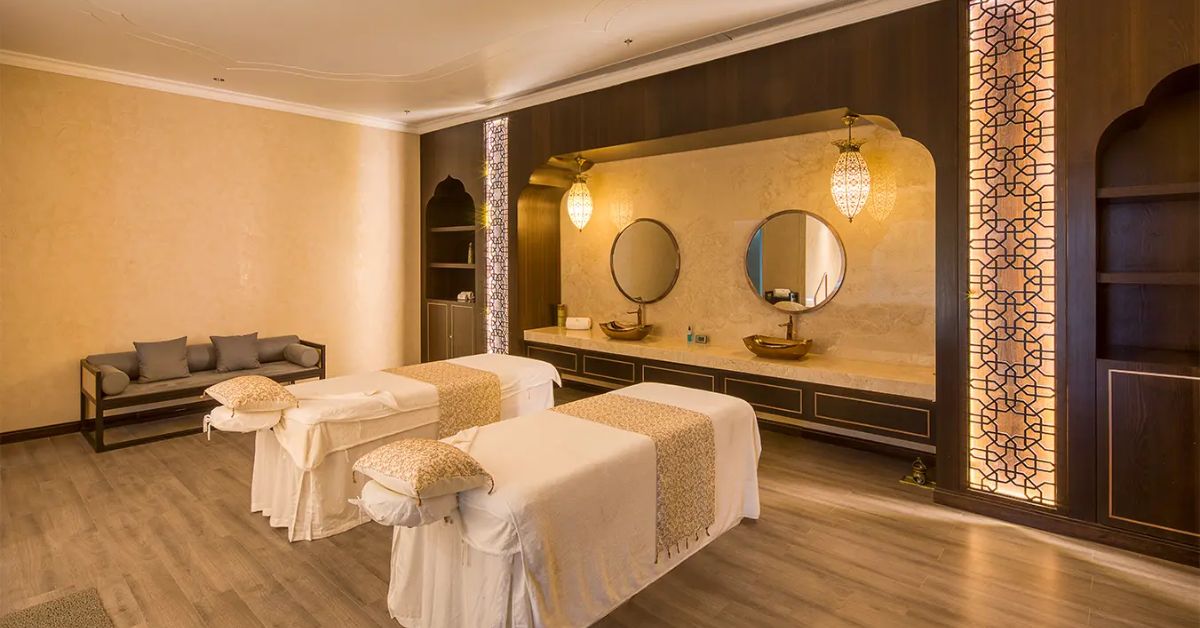
The spa and wellness areas require colors that speak to serenity and rejuvenation. Pale greens, light aqua, and muted blues mimic nature, evoking a sense of calmness and tranquility. These colors, combined with whites or beiges, make the spa feel like a clean, peaceful escape. Adding touches of natural wood or stone further amplifies this sense of harmony, connecting the space to the calming elements of the earth. A careful blend of these shades ensures that guests feel relaxed from the moment they walk in.
Outdoor Spaces
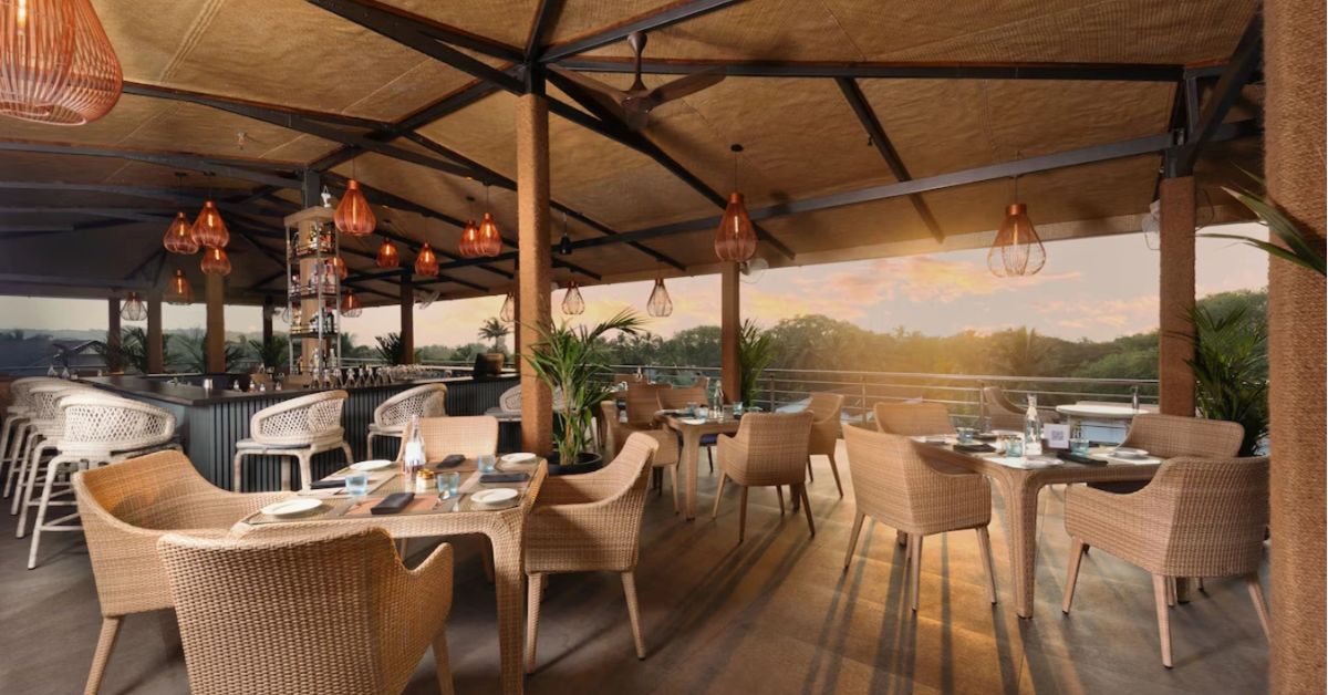
Outdoor spaces such as patios, poolside areas, or terraces thrive on vibrant and refreshing colors. Aqua blue, teal, and even lime green evoke a lively, tropical vibe, while earthy tones like terracotta or sandy beige can help the space feel grounded and organic. Playful pops of color, like coral or sunny yellow in furniture or cushions, can add an element of fun and charm to the area. The goal here is to create a vibrant space that feels energizing during the day and soothing as the sun sets.
Corridors and Hallways
Lastly, corridors and hallways, while transitional in purpose, should still feel inviting and thoughtfully designed. Neutral tones like light gray, pale beige, or soft lavender ensure these spaces feel open and airy rather than narrow or claustrophobic. Small pops of color through art.
Let’s break down what different colors convey in the hospitality industry:
| Color | Emotion | Where to Use It |
|---|---|---|
| Blue | Calm, trust, relaxation | Guest rooms, spas |
| Red | Energy, excitement, appetite | Restaurants, accent walls |
| Green | Harmony, freshness | Wellness areas, lobbies |
| Yellow | Happiness, warmth | Cafes, lounges |
| White | Cleanliness, simplicity | Everywhere (great as a base) |
5 Tips to Make Your Hotel Look Like a 5-Star Property
- Choose a Cohesive Palette: Maintain a consistent color scheme throughout the property. Even with variations, tie the palette back to your brand identity.
- Use Luxurious Colors Wisely: Metallics like gold, silver, or copper add a touch of luxury when used sparingly in fixtures, decor, or accent walls.
- Layer Your Lighting: Colors look different under various lighting conditions. Use warm lighting to enhance reds and golds, and cool lighting for blues and greens.
- Incorporate Local Culture: Use color schemes inspired by the region. For example, terracotta for Mediterranean vibes or tropical greens for a beach resort.
- Incorporate Color Through Decor: Not ready to repaint? Add color through rugs, cushions, art pieces, and flowers. It’s an affordable way to create a visual impact.
Real-World Examples of Color Psychology in Hospitality and Branding
McDonald’s: Red and Yellow

McDonald’s signature red and yellow aren’t just eye-catching, they’re scientifically strategic. Red stimulates hunger, while yellow conveys friendliness and joy, creating the perfect environment for fast, feel-good dining.
Pizza Hut: Dominantly Red
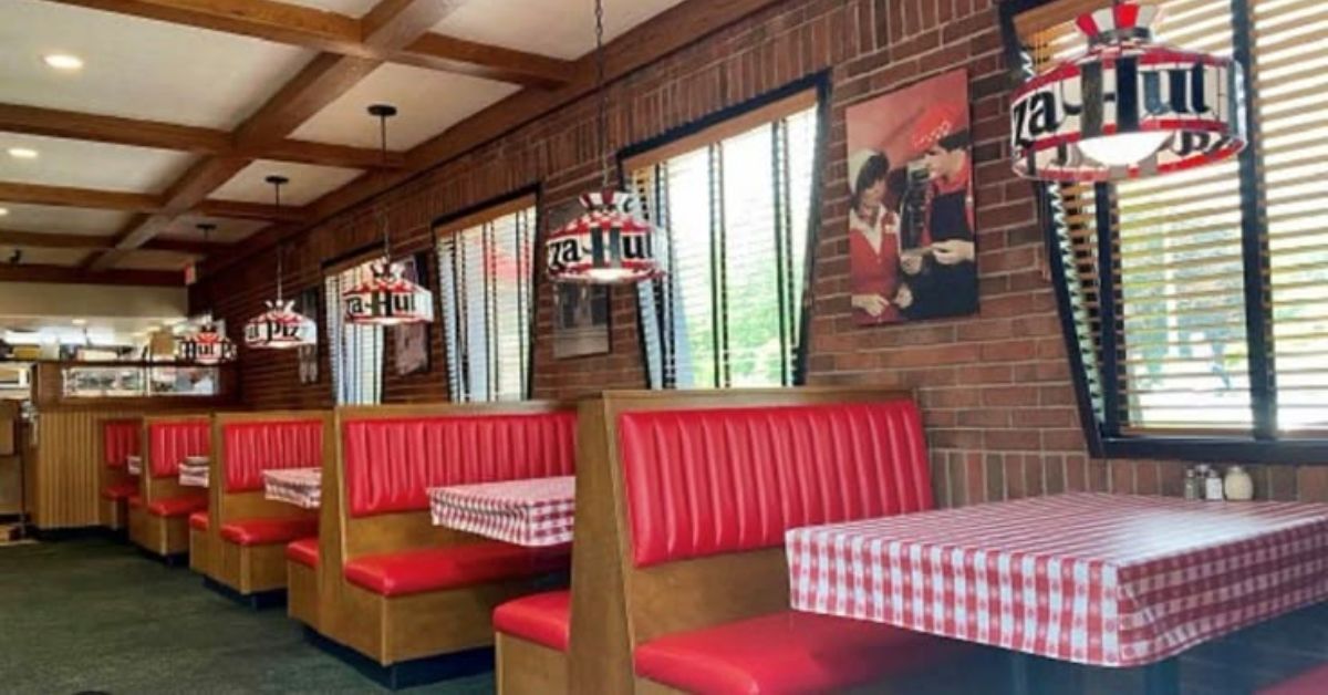
Pizza Hut’s bold red branding is designed to exude energy and excitement. By making guests feel upbeat and hungry, the brand ensures a lively dining experience.
Hotel Ramada Encore: Beige and Brown
Ramada Hotel’s design leans heavily on earthy tones like beige and brown. These natural shades create an inviting and grounded atmosphere, reflecting comfort and stability.
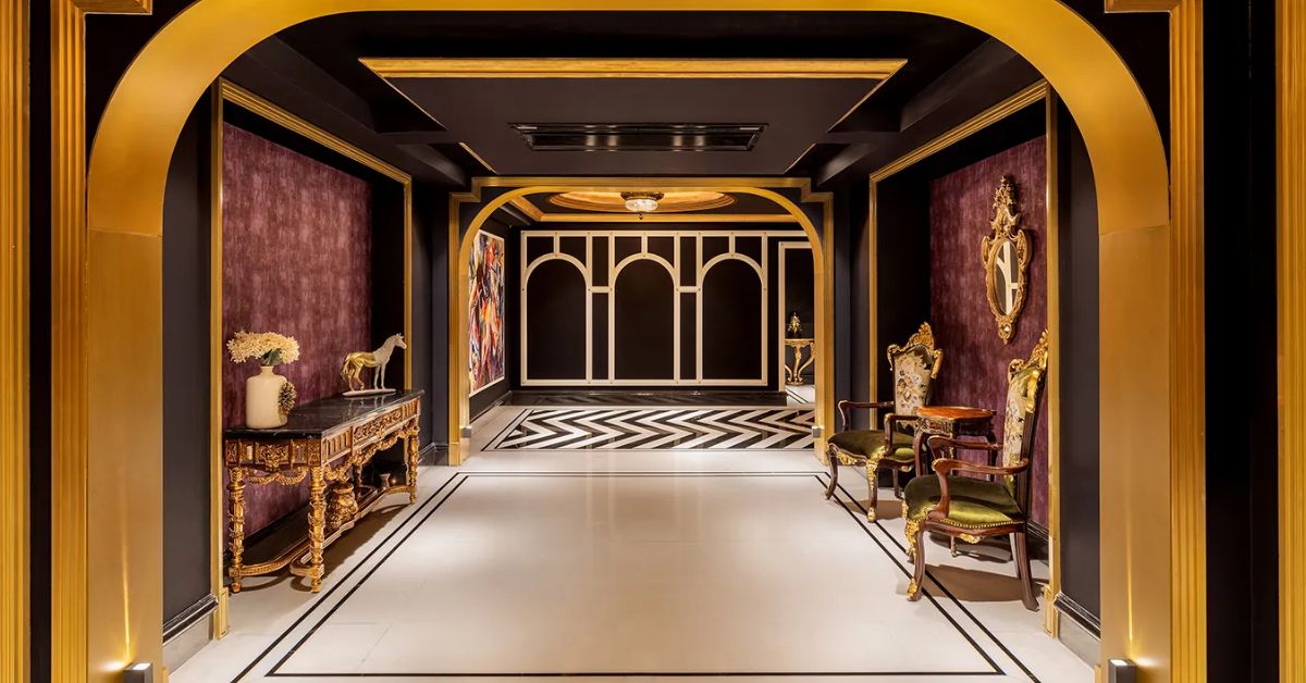
Taj Skyline, Ahmedabad
The color palette of Hotel Taj Skyline, speaks of timeless luxury and sophistication. The gold accents symbolize opulence and grandeur, while the calming whites create a serene ambiance, offering guests an experience of opulence and calm.
The Marriott: Warm Neutrals
Marriott properties often lean on a neutral palette with deep, earthy tones. This creates an air of sophistication that appeals to business and leisure travelers alike.
How to Use Color to Build Brand Identity in Hospitality
Your colors shouldn’t just look good, they should also tell a story about your brand. Here’s how:
- Understand Your Audience: Are you targeting millennials? Try bold, trendy colors. Catering to business travelers? Stick with professional blues and grays.
- Think About Your Location: A beachfront hotel might lean on aquas and sandy tones, while an urban property could embrace chic black-and-white themes.
- Stay Consistent: Your website, logo, and social media should reflect the same color themes guests see when they arrive.
Dos and Don’ts of Using Color in Hospitality Design
Dos:
- Choose colors that align with your brand and location.
- In hotel interior design, test colors under different lighting conditions.
- Use complementary color schemes for harmony.
- Incorporate seasonal updates to keep the design fresh.
Don’ts:
- Avoid overusing bold colors, they can feel overwhelming.
- Don’t neglect the psychology of your target audience.
- Steer clear of clashing hues that might cause visual discomfort.
Conclusion
In hospitality design, color psychology isn’t just a trend, it’s a tool. The right colors can turn your hotel into a 5-star destination, or a hub of energy. From your lobby’s warm neutrals to your restaurant’s energizing reds, every hue has the power to transform how guests feel and remember their stay.
Whether you’re running a boutique inn or a sprawling resort, understanding and applying color psychology could be your secret weapon for standing out in a competitive market. Ready to add some color magic to your space? The time to repaint your story is now.
You May Also Like