CRI vs CCT in Lighting – Guide
CRI vs CCT in Lighting: Simple, Practical Differences (With Spec Checklist)
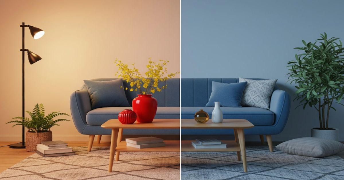
CRI measures how accurately colors appear under your light. CCT measures whether the light itself looks warm (yellowish) or cool (bluish). CRI vs CCT lighting might sound like technical jargon, but the concept is simple. Both matter, but for different reasons: CRI affects color fidelity, and CCT affects mood and atmosphere.
CRI = Color Accuracy (0–100).
CCT = Color of Light (warm→cool).
| Metric | What it is | Typical numbers | Use this when… |
|---|---|---|---|
| CRI | Color accuracy score (0–100) | 80 (standard), 90+ (high) | True-to-life color matters (retail, food, art) |
| CCT | Light's appearance (Kelvin) | 2700–6500K | Mood/alertness & "warm vs cool" selection |
Quick decision: If color accuracy is critical, prioritize CRI 90+. If you're controlling mood or alertness, focus on CCT by space type. For most commercial projects, aim for CRI ≥90 and 3000–4000K; adjust by space using the table.
What Is CRI in Lighting (and What It Isn’t)
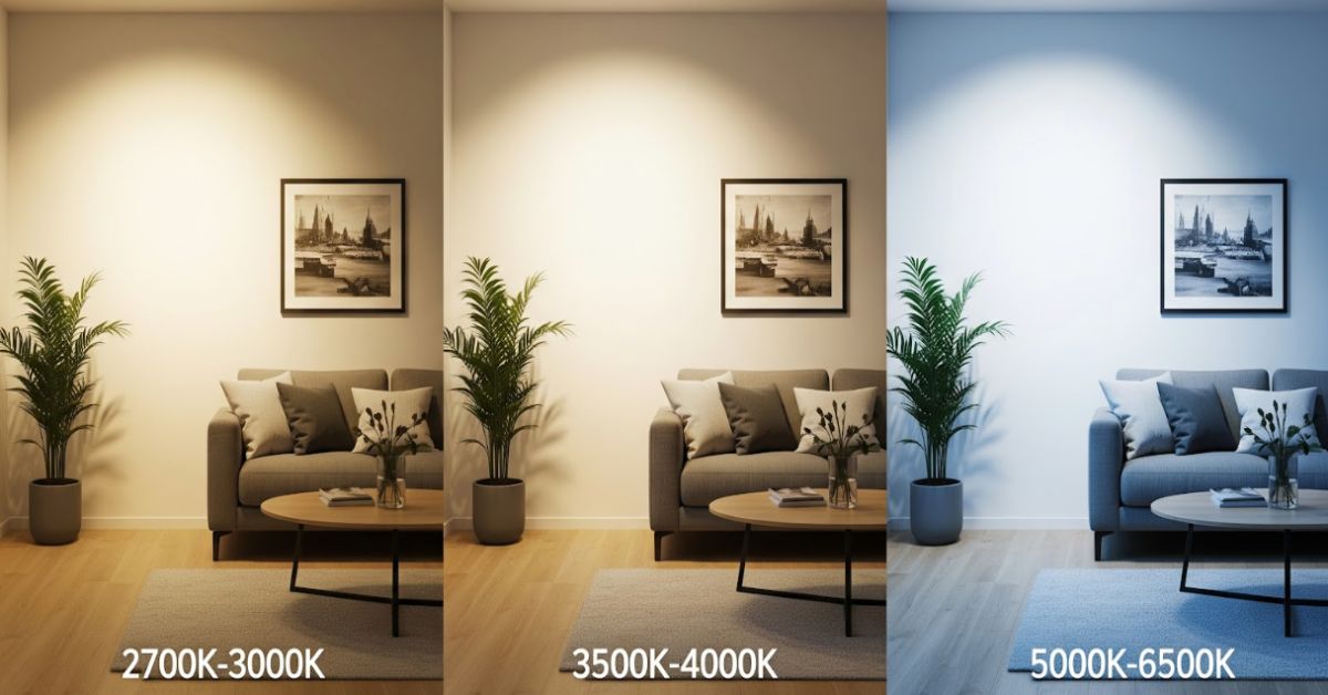
Kelvin scale from 2700K warm to 6500K cool
CRI or Color Rendering Index measures how faithfully a light source reveals colors compared to natural daylight or an ideal reference.
- Scale: 0 to 100 (the higher, the better color accuracy)
- Typical Ranges:
- 80 CRI: acceptable for general offices or corridors
- 90+ CRI: high color fidelity, ideal for retail, hospitality, and art displays
- R9 Value: This sub-score rates how well deep reds appear, critical for skin tones and food presentation.
What CRI in lighting doesn’t measure:
CRI says nothing about the brightness or color temperature of light. Two bulbs can have the same CRI but look completely different, one warm (2700K), one cool (5000K).
In simple terms:
- CRI = how colors appear.
- Not how bright or warm/cool the light feels.
If you want your room to look like the real thing, colors vivid and natural – high CRI lighting is your north star.
What Is CCT in Lighting?
CCT stands for Correlated Color Temperature, which describes the appearance of the light itself – whether it looks yellowish, white, or bluish. It’s measured in Kelvin (K).
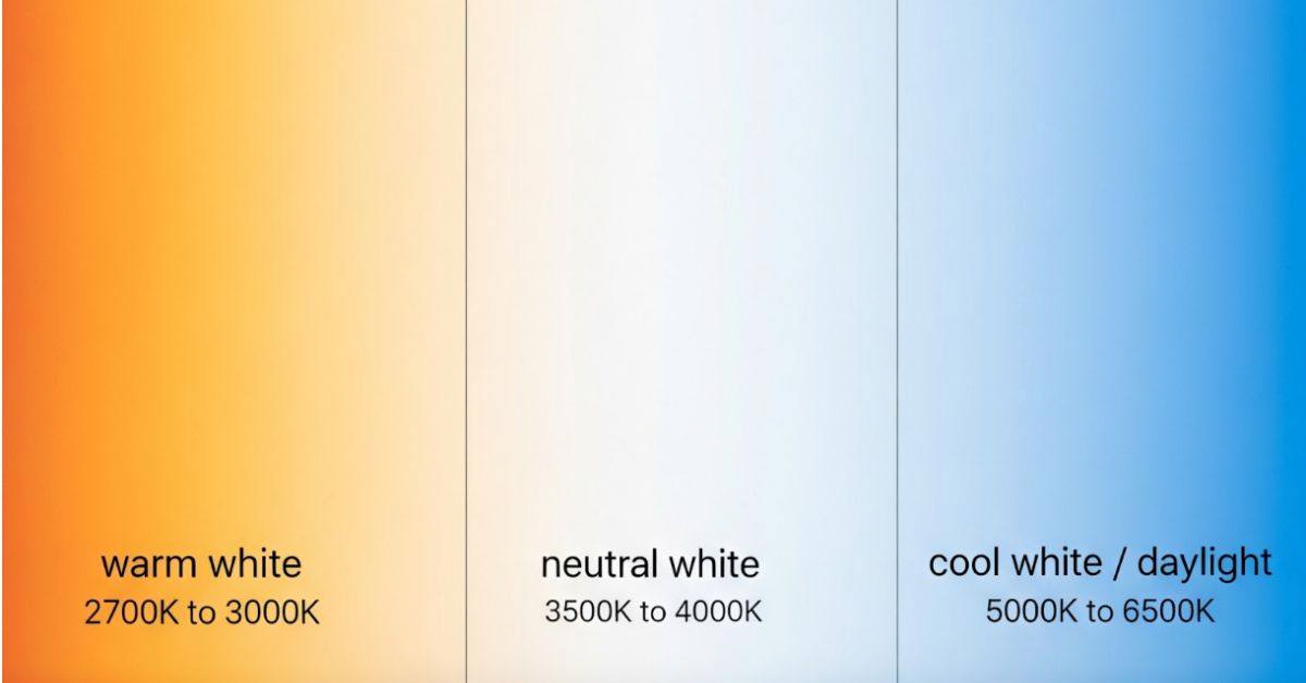
Quick guide to the Kelvin scale:
| Appearance | Color Temperature (CCT) | Where It’s Used |
|---|---|---|
| Warm white | 2700–3000K | Homes, restaurants, hotels |
| Neutral white | 3500–4000K | Offices, schools, hospitals |
| Cool white/daylight | 5000–6500K | Retail, showrooms, outdoor |
Kelvin scale table
Remember:
CCT does not affect brightness. It’s about tone. A 3000K bulb isn’t dimmer than a 5000K bulb with the same lumen output; it just feels warmer.
The Kelvin scale helps you “tune” a room’s mood. Warm tones make spaces inviting. Cool tones enhance alertness and precision.
CRI vs CCT: Side-by-Side Comparison
The difference between CRI and CCT is that CRI focuses on object colors, while CCT focuses on light color.
| Factor | CRI (Color Rendering Index) | CCT (Correlated Color Temperature) |
|---|---|---|
| What it controls | How accurately colors appear on objects | The color appearance of the light itself |
| What it controls | How accurately colors appear on objects | The color appearance of the light itself |
| Measurement | Score from 0–100 | Kelvin scale (2700–6500K+) |
| Higher value means | Better color accuracy | Cooler, more bluish light |
| Lower value means | Duller, less accurate colors | Warmer, more yellowish light |
| Affects brightness? | No, that's lumens | No, that's also lumens |
| When to prioritize | Color-critical tasks: retail displays, food presentation, art, fashion | Setting ambiance and alertness: workspace energy, restaurant warmth, clinical clarity |
| Typical "good" spec | 90+ for commercial quality | Depends on use: 2700–3000K (cozy), 3500–4000K (neutral), 5000K+ (energizing) |
CRI vs CCT in lighting
Bottom line: CRI decides how “real” colors look. CCT decides how the light itself looks. Both are independent. You can have warm (2700K) light with excellent (95 CRI) color rendering, or cool (5000K) light with poor (70 CRI) rendering.
How to Choose: CRI or CCT? (Simple Decision Tree)
Ever wondered which is more important – CRI or CCT? The answer depends on your space and purpose.
Q1: Is color accuracy critical? (Retail products, food presentation, skin tones, art)
- Yes: Prioritize CRI 90+. Also, verify R9 if food/skin matters.
- No: CRI 80 is usually acceptable.
Q2: Do you need to control mood or alertness?
- Warm/relaxed atmosphere: Choose 2700–3000K (restaurants, hotel rooms, lounges).
- Neutral/flexible spaces: Choose 3500–4000K (offices, retail, corridors).
- Bright/energizing environment: Choose 5000–6500K (hospitals, warehouses, gyms).
Q3: Do you care about both?
- Most commercial projects: Aim for CRI 90+ with 3000–4000K. This covers offices, upscale retail, and hospitality public areas.
- This combination delivers excellent color accuracy while offering flexibility in creating either a warm, welcoming environment or a clean, modern one.
Fine-tune by sector using the table below.
Recommended CRI & CCT by Space (Quick Reference)
Color Temperature Chart
Use this table as a starting point for your lighting specifications. Remember that brand identity and specific design intent can always influence the final choice. Want to explore more design concepts? Browse our lighting collection for modern solutions that complement every mood.
| Space Type | Recommended CRI | Recommended CCT | Why |
|---|---|---|---|
| Offices (general) | 80–90 | 3500–4000K | Balanced clarity without harshness; supports focus |
| Offices (general) | 80–90 | 3500–4000K | Balanced clarity without harshness; supports focus |
| Offices (creative/design) | 90+ | 3500–4000K | Color accuracy matters for presentations and materials |
| Hotels – Lobbies | 90+ | 2700–3000K | Warm, welcoming, accurate skin tones and materials |
| Restaurants | 90+ (strong R9) | 2700–3000K | Food looks appetizing; warm atmosphere |
| Retail – Fashion/Apparel | 90+ | 3000–3500K | True fabric colors; slightly warm but clear |
| Retail – Jewelry/Luxury | 95+ | 3000–3500K | Reveals material quality and color nuances |
| Art Galleries/Museums | 95+ | 3000–3500K | Preserves artist intent; minimal color distortion |
| Hospitals/Clinics | 80–90 | 4000–5000K | Clarity for examinations; neutral to cool |
| Warehouses/Industrial | 80 | 5000–6500K | Cost-effective; bright, alert environment |
CRI for offices, hotels, and retail
Geographic note (India & GCC): While the principles above are universal, regional preferences exist. In India and the GCC (Gulf Cooperation Council) region, there is often a cultural preference for cooler CCTs, even in residential and hospitality settings. Offices in these regions often lean toward 3500–4000K for a crisp, professional feel. Premium hospitality properties typically favor 2700–3000K to match international luxury standards.
Common Myths About CRI and CCT (Fast Fixes)
The cri vs cct lighting topic is filled with misconceptions. Let's clear up two of the most common ones.
Myth 1: Higher CCT means brighter light
False. Brightness is measured in lumens, not Kelvin. A 5000K light can be dim if it's low in lumens. A 2700K light can be very bright if it has high lumens. CCT only affects the color appearance (warm vs cool), not intensity.
Myth 2: CRI changes the color of the light
False. CRI does not affect the light's warm or cool appearance; that's the job of CCT. Instead, CRI affects how the colors of objects under that light are rendered. A 3000K light will always look warm yellow, but a high-CRI 3000K light will make a red apple look richly red, while a low-CRI 3000K light might make it look dull and brownish.
Myth 3: 80 CRI is always enough
Depends on the application. For warehouses or back-of-house areas, 80 CRI works fine. For retail, food service, or hospitality guest areas, 90+ CRI makes a visible difference in how products, food, and people look. The jump from 80 to 90 CRI is noticeable on saturated colors and skin tones.
Myth 4: Daylight is always 6500K
Not exactly. Natural daylight varies from roughly 5000K (midday sun) to 6500K+ (overcast sky). "Daylight" bulbs are typically rated 5000–6500K, but the label is more marketing than precision. For true color-matching work, specify the exact Kelvin and use high CRI (95+).
Conclusion
CRI and CCT work hand in hand; one ensures accuracy, the other defines ambience. If you’re designing or specifying lighting, prioritize CRI ≥90 for true color and choose CCT between 3000K–4000K for versatile mood control.
FAQs
1. What's the difference between CRI and CCT?
CRI measures color accuracy (how true-to-life objects appear under the light, scored 0–100). CCT measures the light's own appearance (warm yellowish to cool bluish, measured in Kelvin). They're independent specs; you choose both based on your needs.
2. Is higher CRI always better?
Generally, yes for color-critical spaces. CRI 90+ is considered "high quality" and makes a noticeable difference in retail, hospitality, and anywhere color matters. For non-critical areas like storage or circulation, 80 CRI is acceptable and more cost-effective.
3. Does CRI affect brightness?
No. Brightness is controlled by lumens. CRI only affects how accurately colors are rendered. A high-CRI light can be dim (low lumens), and a low-CRI light can be very bright (high lumens). They're separate specifications.
4. What CCT is considered "daylight"?
Approximately 5000–6500K. Natural daylight varies by time of day and weather, but "daylight" bulbs are typically rated in this range. For color-matching work, specify the exact Kelvin (e.g., 5000K) and combine with high CRI (95+).
5. 80 CRI vs 90 CRI: Will I actually notice the difference?
Yes, especially on saturated colors, skin tones, and food. The jump from 80 to 90+ CRI makes reds richer, skin more natural, and products more vibrant. In side-by-side tests, most people can see the difference. For premium commercial spaces, 90+ is worth the investment.
6. What's the best CRI and CCT for offices? Hotels? Retail?
For offices, aim for CRI 80+ and 3500–4000K CCT. For hotels and restaurants, specify CRI 90+ and 2700K-3000K CCT. For high-end retail, demand CRI 95+ and a CCT (3000K-4000K) that matches the brand's aesthetic. Refer to the quick-reference table above for more details.
7. Does geography change ideal CCT?
Slightly. Regions with very bright natural sunlight (like India and the GCC) sometimes prefer slightly cooler office lighting (3500–4000K) for a crisp feel. Cultural preferences also play a role; some markets associate warmer light with luxury, others with dated design. The ranges above work globally; fine-tune based on client expectations and local norms.
Glossary of Essential Lighting Terms
- CRI (Color Rendering Index): A 0–100 score measuring how accurately a light source reveals true colors compared to natural daylight. Higher is better for color-critical applications.
- CCT (Correlated Color Temperature): The appearance of light is measured in Kelvin (K). Lower values (2700K) are warm/yellowish; higher values (6500K) are cool/bluish.
- Kelvin (K): The unit for measuring color temperature. Named after physicist Lord Kelvin. In lighting, it describes whether light looks warm or cool.
- Lumens: The measure of total light output (brightness). Separate from both CRI and CCT.
- R9: A specific CRI test color for deep red. Standard CRI (Ra) often scores well, even with poor red rendering. Check R9 separately for food, skin tones, and rich fabrics.
- TM-30: A newer color rendering standard that provides more detailed color fidelity data than traditional CRI. Includes measures for color saturation and hue accuracy. Gradually replacing CRI in technical specifications.